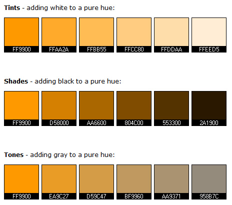
Tints, Shades, and Tones
Expand your understanding of why some colors look better next to one than another. Practice creating tints, tones, and shades and then use them in an abstract painting.
Learning to create tints, tones, and shades can give you greater flexibility in creating art. Understanding these color concepts will also help you to understand why even complementary or analogous colors, schemes based on the color wheel, sometimes don’t match.
Defining Tint, Tone, and Shade
- Add white to a color to create a tint.
- If you add gray to a color, you produce a tone.
- Add black to a color to make a shade.
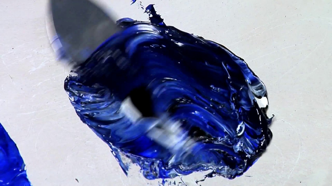
Creating Tones
You will need tempera or acrylic paints, a paintbrush, and paper that will support the paint without buckling. You should have a few plastic plates or a palette that will allow you to mix colors.
Select one color, such as red, green, or blue along with white and black.
Start by mixing your gray paint. Combine increasing quantities of black into white paint. Make enough of each color so you can use it to mix in with color later on. Paint a tonal scale, moving from creating a square of white paint through your shades of gray until you reach black. Try for a range of five to ten shades of gray.
Now, add the pure color that you selected earlier in equal amounts to the different shades of gray that you created. Paint a tonal, or value, the scale for this color, moving from the pure color to the color with darker and darker shades of gray.
Creating Tints
Mix the pure color with increasing quantities of white so that the color lightens. Paint a square of the lightest color and then immediately next to it, paint the next darkest color. Continue until you paint a sample of the pure color.
Creating Shades
Mix the pure color with increasing quantities of black making the color darker in small increments. Make a shade scale by painting a square of the original color and then next to it painting the lightest of the shades. Continue painting darker shades in a strip until you reach black.
An Art Project Using Tints, Tones, or Shades
Set a pencil onto a piece of paper and draw an overlapping squiggle, ending the image by connecting to the starting point. Paint each of the spaces using the tint, the tone, or the shade palette that you created. This abstract squiggle creates a pleasing image using a color accentuated with white, gray, or black.
Combining Tints, Tones, and Shades with Other Colors
If you paint a tint, tone, or shade of color and set it next to a different pure color (for example, pale orange next to pure blue), the colors may not look pleasing because they will be different intensities, one color many seem too heavy or bright for the other color.
See this for yourself by taking the complement of your tint, tone, or shade and painting a swatch of it next to the other colors. (The complementary color is opposite your color on the color wheel.)
Shades or tints of blue will work well next to one another, but if you throw in pure purple, the color will look off. However, if you use a shade or tint of purple the black or white that the two colors have in common will tie them together.
Use these exercises to practice creating tints, tones, and shades of different colors. This training will give you a better understanding of how to combine colors in art and craft projects whether you are working with paint, colored pencil, yarn, or fabric.