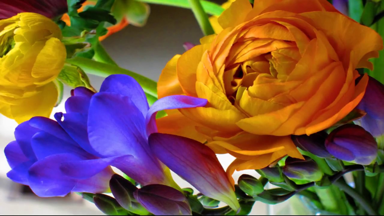
Complementary Colors
Complementary colors are those on opposite sides of the color wheel. These combinations are vivid and eye-catching. Create a cut-paper project to highlight the contrast.
Take the guesswork from combining colors by giving a little attention to the color wheel. Whether you are working on a craft project or trying to coordinate colors of party decorations, knowing how to harmonize colors can make it easier to know what will look good together.
Start by making a twelve-color color wheel so you can really see your options while Understanding the Color Wheel.
Creating a Twelve Color Wheel
You will need colored pencils, white paper (photocopy paper is fine), and a dessert plate.
Trace a dessert plate and divide the circle into twelve equal sections.
Color the sections clockwise in this order – red, red-orange, orange, yellow-orange, yellow, yellow-green, green, blue-green, blue, blue-violet, violet, and red-violet.
Try to use equal pressure when coloring each section. You don’t have to bear down hard. Draw with short back-and-forth strokes that will allow you to build up the color. When coloring tertiary colors (colors that are a mix of two colors, red-violet for example), first color the area with one pencil and then the other, blending the colors together.
What are Complementary Colors?
Complementary colors are those colors at opposite sides of the color wheel. So, red and green, orange and blue, and yellow and purple are three of the possible complementary color combinations. You’ll also get combinations like red-violet with yellow-green. Other common combinations include Analogous Colors.
Since, looking at the color wheel, you can only see the tips of the complementary colors touching one another you may want to color a two-inch square sample of each of the complementary color combinations. This will give you a sense of why some complements exist (red and green are complements as are yellow and violet).
What are Split-Complementary Colors?
You may notice that complementary color combinations are vivid. Split-complementary colors create less harsh combinations. Split complementary colors are the colors on either side of a compliment. For example, purple and yellow are complements. Split complements would be yellow, blue-violet, and red-violet; or, purple, yellow-green, and yellow-orange.
Complementary Color Kirigami Project
Kirigami is the Japanese word for cut paper. You will cut one sheet of paper and then glue it onto a complementary color to create a stunning design.
- You will need two sheets of construction paper in complementary colors.
- Fold one sheet of paper on the diagonal and trim off the excess so you have a square piece of paper.
- Fold the square along the fold line you already made so you have a triangle.
- Along the long base of the triangle, fold one of the corners up to the top. Do the same with the other corner so you have a diamond shape.
- Fold the diamond in half.
- Along the other two edges (not the fold you just created), cut out curved lines, rectangles, triangles, etc. If you cut along the incorrect fold, you will end up with more than one final piece. You can still use these pieces.
- Glue the kirigami design onto the complementary color sheet of paper and display. For a more elaborate design, try the Positive and Negative Space Art Project.
Combining complementary colors, colors on either side of the color wheel, gives you flexibility in creating vivid color combinations. After trying this art project, see what other ways you can introduce complementary and split-complementary color schemes into your surroundings.
