Blending Analogous Colors
Analogous colors are colors next to one another on the color wheel. Discover how you can use these combinations to make great art and to get dressed in the morning.
 Have you ever wondered why some color combinations look great together while other combinations somehow look “off”? Color schemes, combinations of colors, based on the color wheel can give you a sense of why some colors look better next to others.
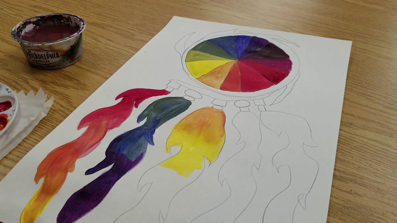
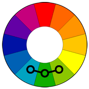
Analogous colors are the colors that are next to one another on the color wheel. On a basic six-color wheel, you would get the following two-color combinations
- Red and orange
- Orange and yellow
- Yellow and green
- Green and blue
- Blue and purple
- Purple and red
If you want, you can create a color wheel and play around with basic color schemes. Try creating a twelve-color wheel, including colors such as red-orange between the red and the orange. These tertiary colors give you even more color schemes.
Creating Two-Color Analogous Color Combinations
Get a pack of basic color markers, crayons, or colored pencils. Color a two-inch stripe with each analogous color combination – make each color one-inch and have them touch. Leave some white space between the different combinations so the colors don’t influence one another.
Notice how because these colors sit next to one another on the color wheel they have something in common. Orange looks good next to red or yellow because together those colors mix to make orange.
Three Color Analogous Combinations
Together red, orange, and yellow create a trio of warm analogous colors. Green, blue, and violet tend to be considered cool colors. A combination of orange, yellow, and green will make the green seem warmer. If you include tertiary colors, you’ll get even more analogous color combinations.
Create as many three-color analogous combinations as you can, coloring a three-inch stripe with each color an inch square.
If you were decorating your room or getting dressed in the morning, you could use your knowledge of analogous colors to match clothing. Select one color as your dominant color (blue pants), a second color to support the first (green sweatshirt), and the final color as an accent (a yellow hat).
Cubism-Inspired Art Project
On a sheet of paper, draw a simple image (house, animal, flower, etc.) Think of a picture you might find in a coloring book for young children – it shouldn’t have too many details.
Take a ruler and a pencil and draw three lines across the image in one direction and four lines across the other direction. Draw the lines at diagonal angles in different directions.
Now, look at the three-color analogous combinations you discovered and select your favorite. Take those three pencils, plus black and white.
To color your image, each time you cross a line, you will change colors giving your final picture a cubist feel. It doesn’t matter if the line is part of your image or is one of the lines you drew through the image. For each line, you cross, change the color, no matter how big or small the area is, including the background.
You will only use these five colors (you don’t have to color the white sections since the paper is white, but having the pencil there is a good reminder) to color the image. Try to avoid using the same color for two sections that are next to one another. (If points touch, that is okay.)
Learning to use analogous colors will make it easier to select color combinations for your room, your clothing, party decorations, and art and craft projects. Keep the examples you colored for future reference until thinking about analogous combinations becomes natural.